08 April, 2026 by admin
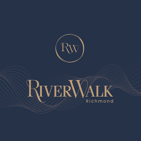
River Walk
by adminFrom Blueplan to Visual Reality The Vision: Flow & Harmony | Riverwalk is more than a residence; it is a “balance in motion.” Strategically positioned between Richmond’s urban pulse and the serene Fraser River, our brand...
![[APP]Letss.help](https://lulustudio.ca/wp-content/uploads/2025/04/Depth-App-Presentation-Mockup-1024x682-1-1015x682.jpg)

![[package] Islelalulu-pets](https://lulustudio.ca/wp-content/uploads/2020/03/Screenshot-2025-04-15-at-20.31.52.png)