KIN & CANOPY
The Architecture of Belonging: Redefining Luxury for KIN & CANOPY
In the saturated landscape of high-end lifestyle brands, “luxury” has become a diluted currency. At Lulustudio, our philosophy transcends the superficial; we believe that true brand equity is built at the intersection of visceral emotion and architectural precision. Our latest partnership with KIN & CANOPY serves as a definitive case study in how design-led strategy transforms a business from a mere service provider into a cultural landmark.
Lulustudio Insight . KIN & CANOPY . 4/25/2026The Strategic Soul
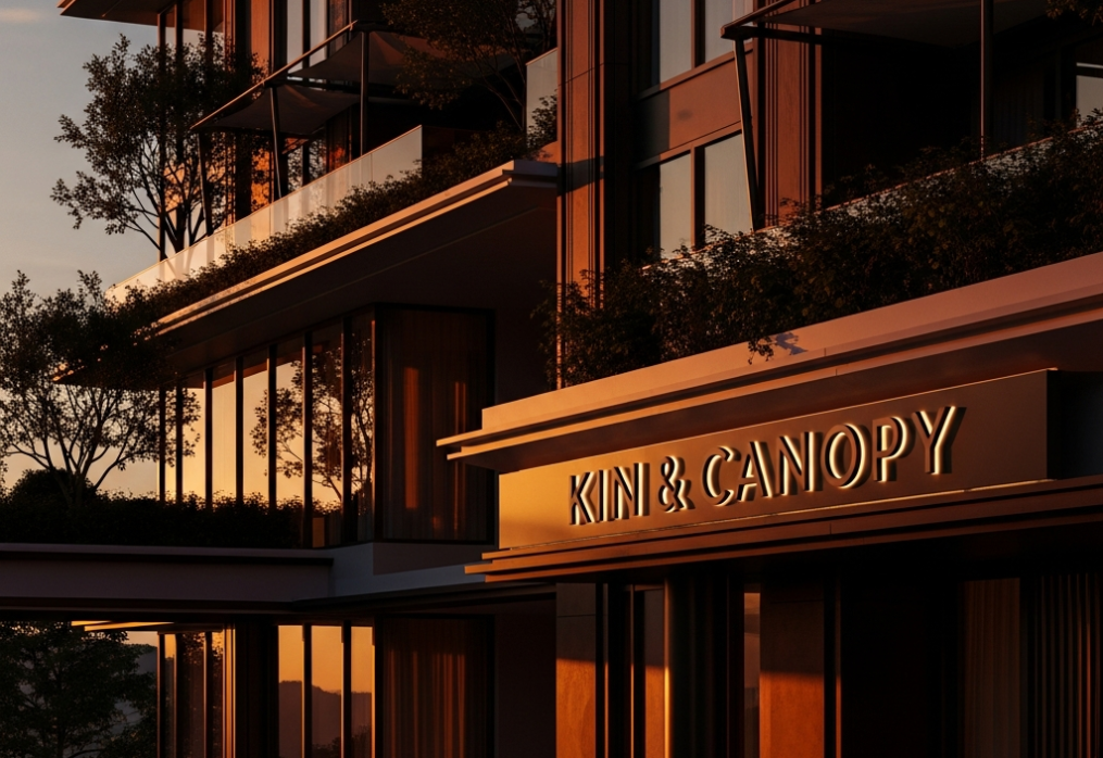
The genesis of KIN & CANOPY lies in the dualistic nature of the modern connoisseur’s life: the yearning for ancestral connection (*Kin*) and the necessity of sophisticated sanctuary (*Canopy*).When the founders approached Lulustudio, the directive was clear: create a visual and narrative language that speaks to “The New Heritage.” We moved away from the tired tropes of traditional opulence. Instead, we crafted a story centered on the *luxury of presence*. KIN & CANOPY is not merely a brand; it is a curated ecosystem where the ruggedness of the natural world meets the meticulous refinement of modern minimalism. It is the feeling of being sheltered by a masterfully designed structure while remaining intimately connected to the earth beneath one’s feet.
Chromatic Philosophy
Color is the most immediate, non-verbal communicator of brand value. For KIN & CANOPY, we curated a “Tactile Earth” palette designed to evoke permanence and serenity.The foundation is Obsidian Noir, a deep, architectural black that provides a sense of authority and grounding. This is contrasted by Mist-Shorn Sage, a muted, organic green that reflects the canopy of the wild. To inject a sense of warmth and elite hospitality, we introduced Alabaster Bone and Burnished Champagne.This is not a palette designed for a single season; it is a timeless spectrum. The interaction between these shades creates a sensory experience that feels both expansive and protective. In digital applications, these colors provide a high-contrast, premium readability; in physical spaces, they harmonize with natural light and raw materials like stone and timber.
Commercial Trajectory
From a design-led business perspective, KIN & CANOPY enters the market at a pivotal moment. The post-luxury consumer is no longer seeking “more”—they are seeking “better.” Our analysis identified a significant gap in the boutique hospitality sector: the absence of brands that offer both high-design aesthetics and authentic community values.By positioning KIN & CANOPY through a lens of *Visual Silence*, we have created a competitive advantage. In a market shouting for attention with neon and noise, KIN & CANOPY whispers. This restraint signals confidence, attracting a high-net-worth demographic that prizes discretion over display.The ROI of this design strategy is evident in the brand’s ability to command premium pricing. By investing in a cohesive, elite identity, KIN & CANOPY does not just enter the market—it dictates it. This is the Lulustudio promise: we don’t just design for beauty; we design for the hegemony of the brand in its niche.*Lulustudio | Design Director
*Transforming Vision into Visual Legacy.*